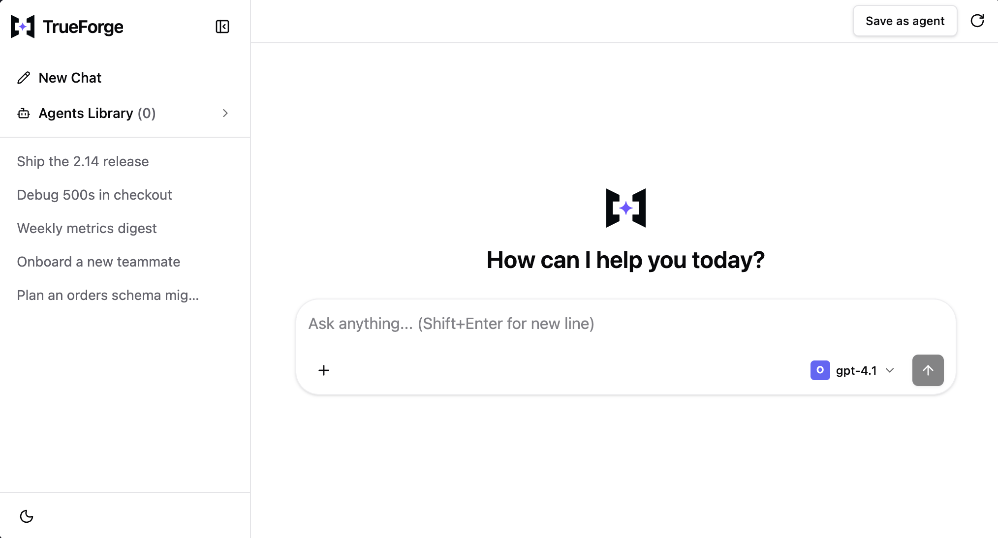
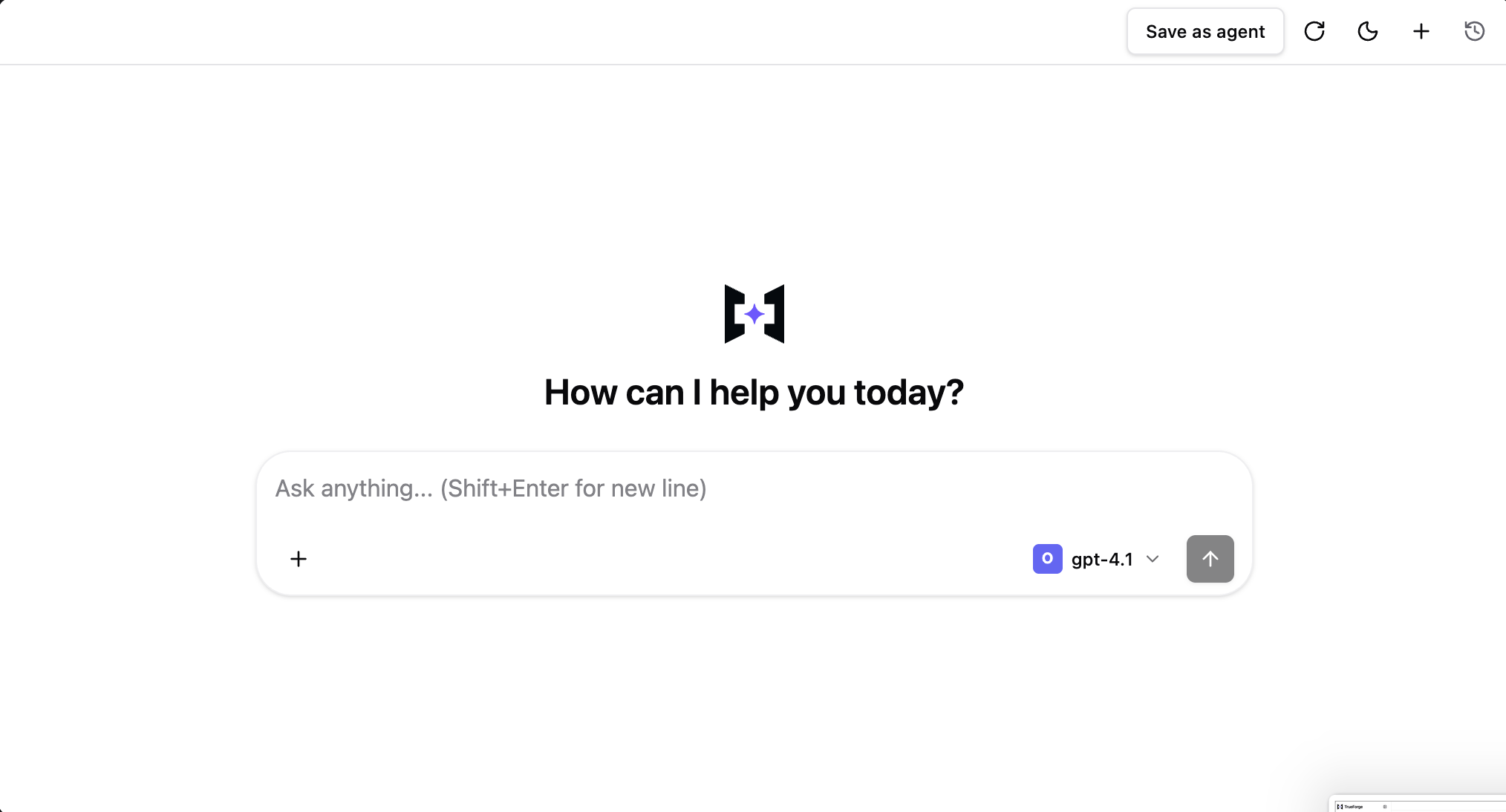
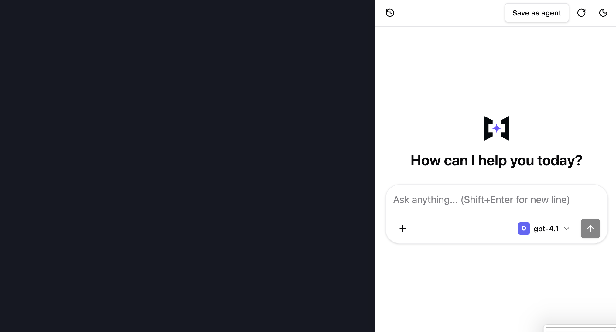
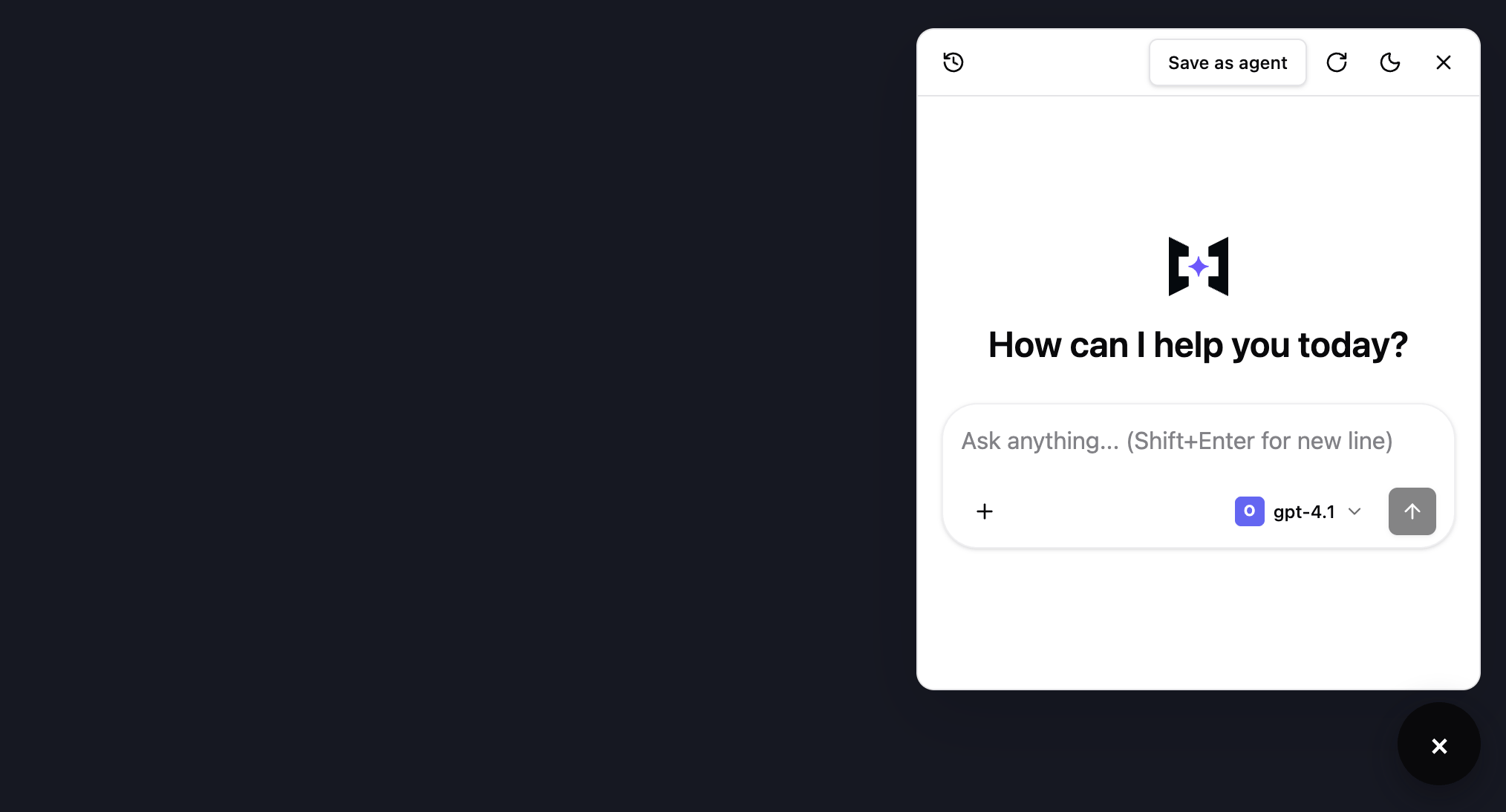
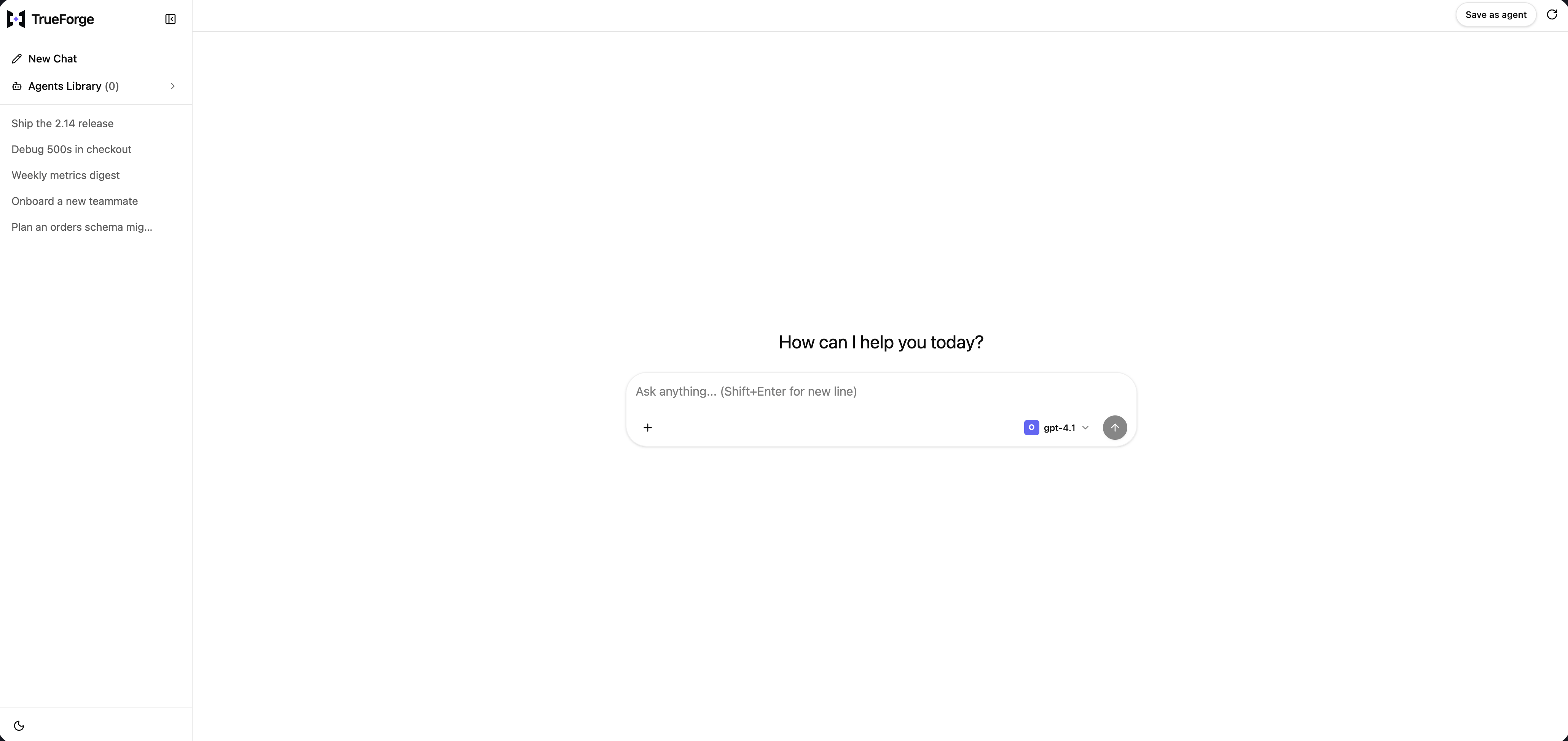
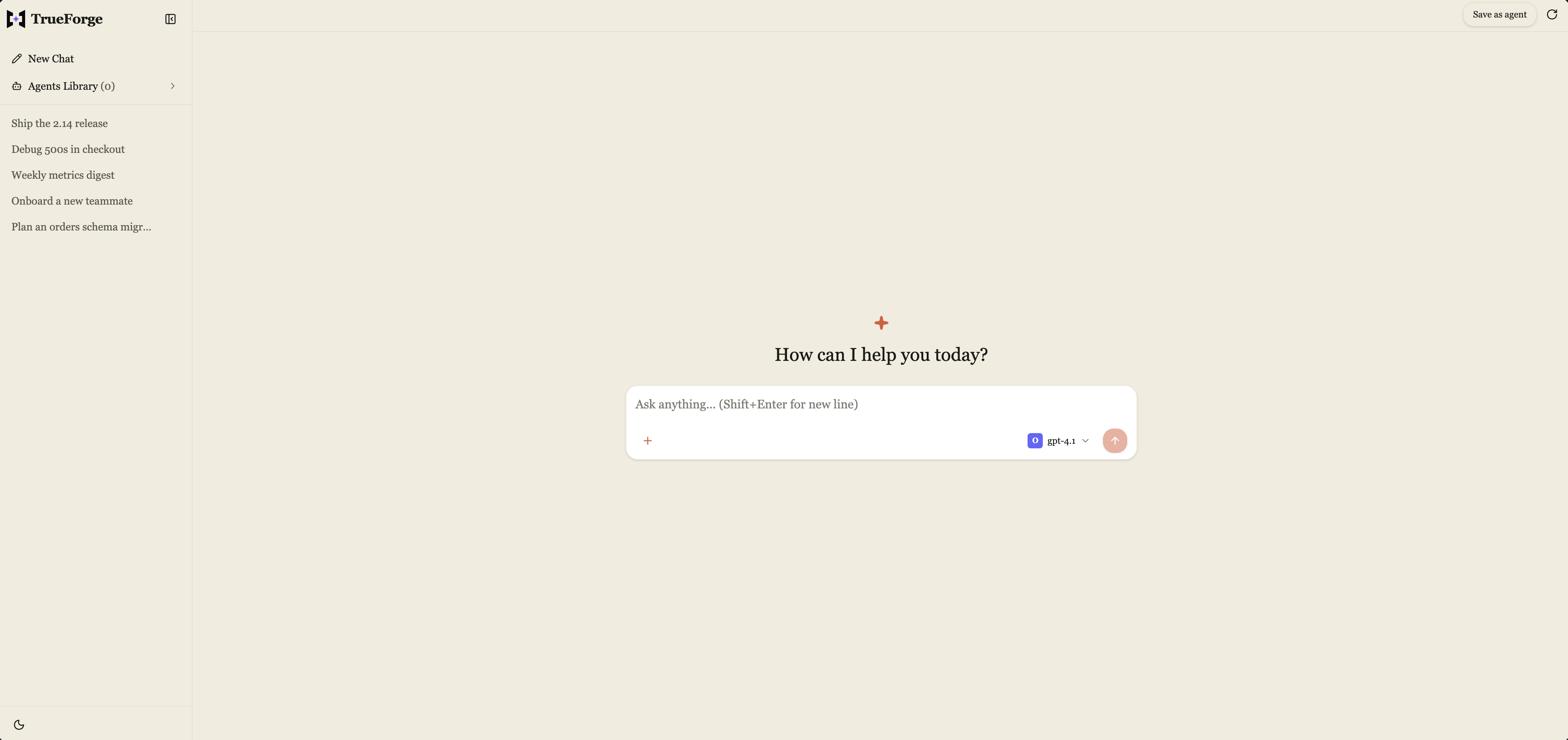
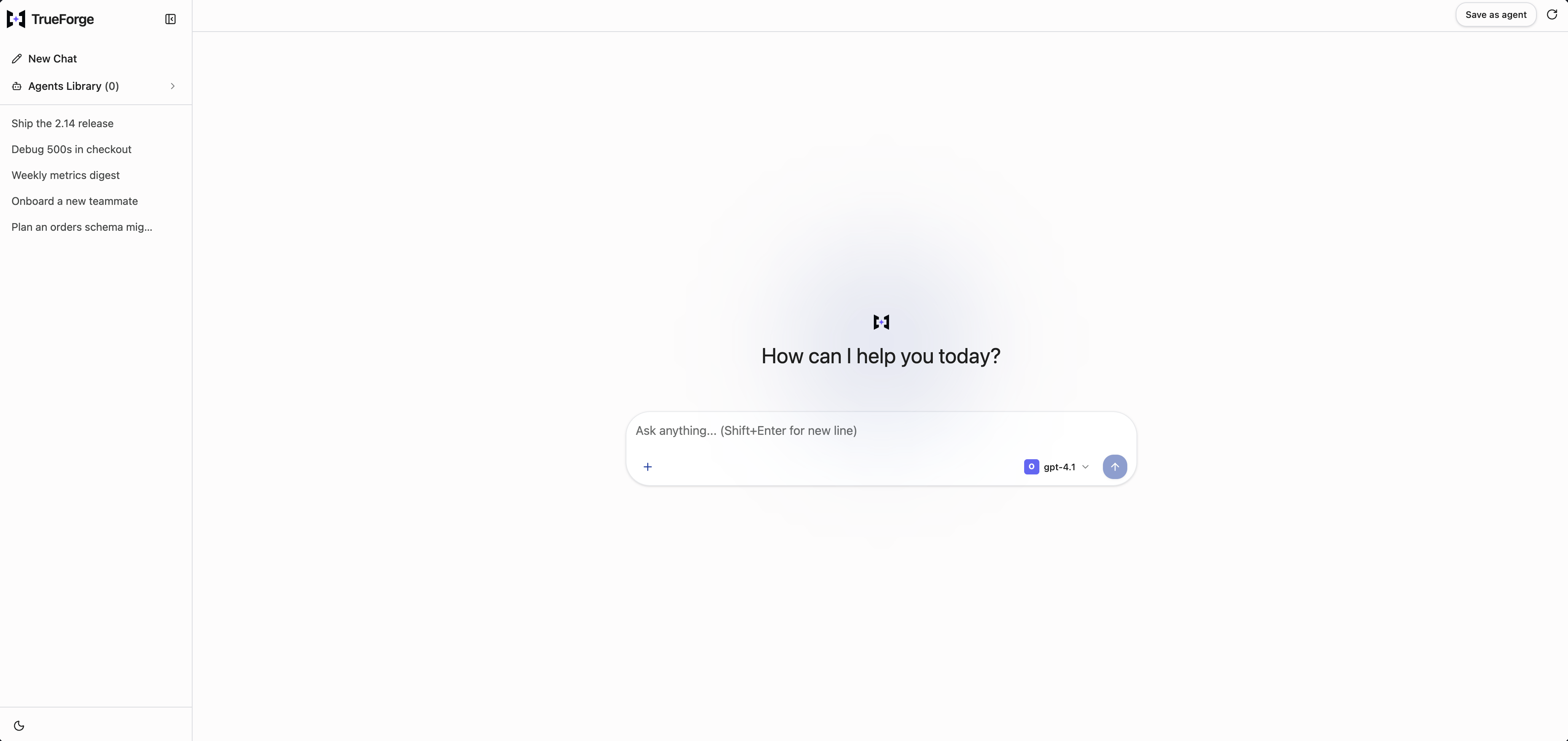
The sidebar view is the default layout. You can customize the layout by passing one of the predefined options: sidebar, drawer, dock, or widget.
sidebar(default)
drawer
dock
widget
A full-page chat experience with persistent conversation history in a left sidebar. The default choice for a dedicated chat surface.
<TrueForgeUI server={server} layout="sidebar" />
Sidebar: full-page chat with the thread list pinned on the left.
Chat history is tucked into an overlay drawer and can be opened using the history icon. Ideal for smaller viewports, such as tablets and compact monitors, where screen space is limited.
<TrueForgeUI server={server} layout="drawer" />
Drawer: the thread list collapses into an overlay for narrow viewports.
A chat panel pinned to the right edge, using the available space up to a maximum width of 400px.
<TrueForgeUI server={server} layout="dock" />
Dock: a compact panel pinned to the right edge, up to a 400px cap.
A floating chat launcher that expands into a compact chat panel when opened.
<TrueForgeUI server={server} layout="widget" />
Widget: a floating launcher that expands into a compact chat panel.
Built-in layouts are code-split, so only the layout you use is loaded into your bundle. The other three layouts are excluded, keeping your bundle size smaller. A lightweight placeholder is displayed while the selected layout loads.
icon is the square asset used in collapsed and compact surfaces. logo is the wider
asset used when mode is "logo" and requires icon as its compact fallback. When
brand is omitted, expanded chrome uses the built-in TrueForge wordmark and compact
surfaces use the built-in square mark.The chatgpt, claude, and gemini themes are shown below:
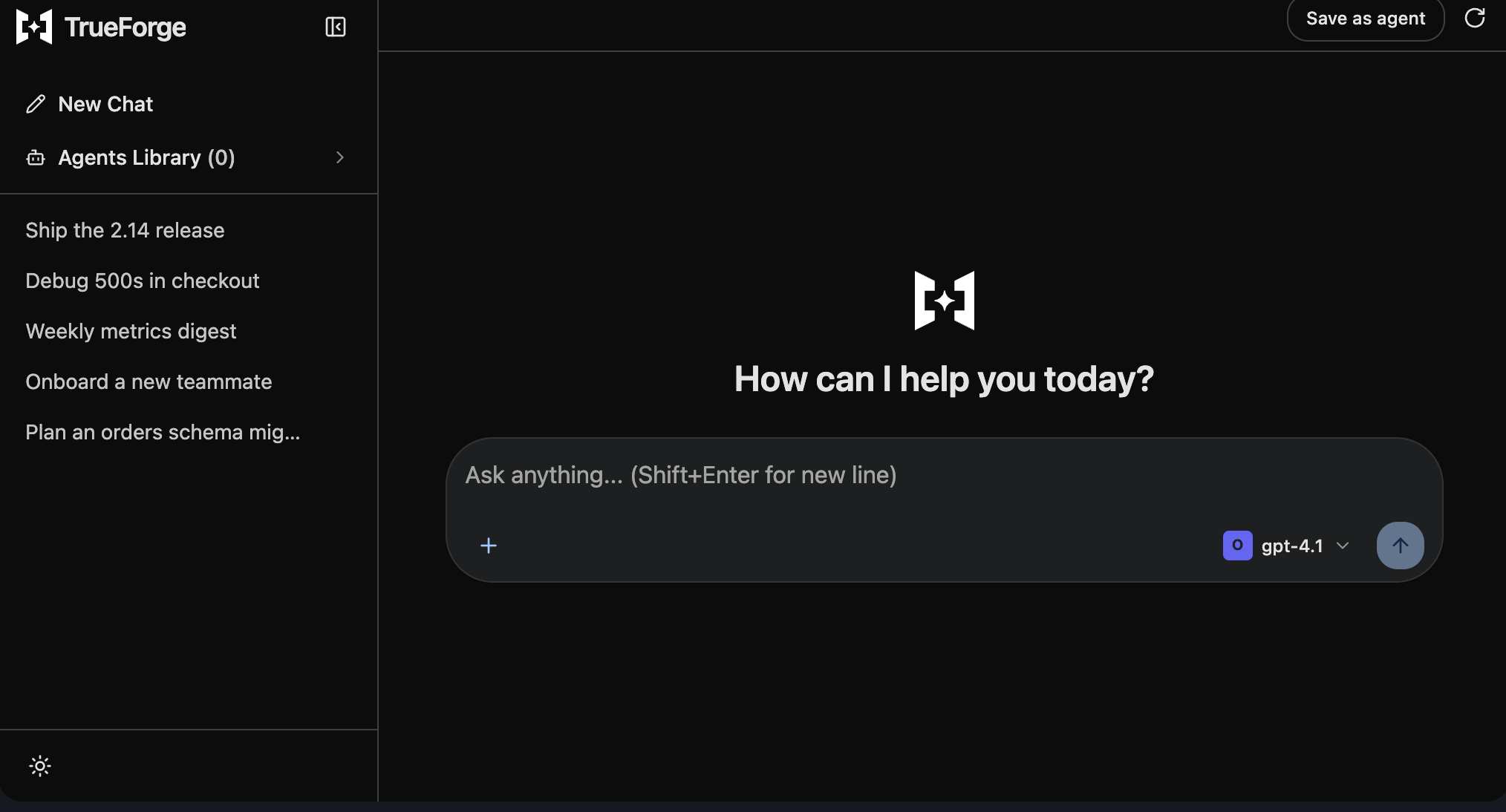
If you omit this key, the SDK defaults to the system theme, and users can switch between light and dark mode through the UI.If you want the SDK theme to follow your application’s theme, set this value to light, dark, or system. This allows the SDK to stay in sync with the main application theme. When the theme is explicitly set, the user cannot change it through the UI.
The icon and logo sources are selected based on the resolved theme mode. When mode is omitted, they automatically follow the system theme.
Provide both light and dark to use a different image for each mode.
Provide only one of light or dark to use the same image in both modes.
Use src for a mode-independent image.
Set brand.mode first (icon-title | icon-only | logo); name is required and always labels images.
Visible title text only appears for mode: "icon-title".
Set the brand-level href to make configured images clickable.
For more advanced use cases, such as rendering an inline SVG or an animated logo, override the BrandLogo slot instead of passing a React node through the theme object.